Checkout Optimization: 12 Ways to Reduce Cart Abandonment
Reduce checkout friction with practical improvements to speed, trust, forms, payment options, mobile usability, and post-purchase flow.
Remove unnecessary decisions
Checkout is not the place to introduce complexity. Every extra field, unexpected fee, unclear instruction, or competing link gives the customer another reason to stop.
Ask only for information required to process the transaction, manage risk, deliver the product, or meet legal requirements.
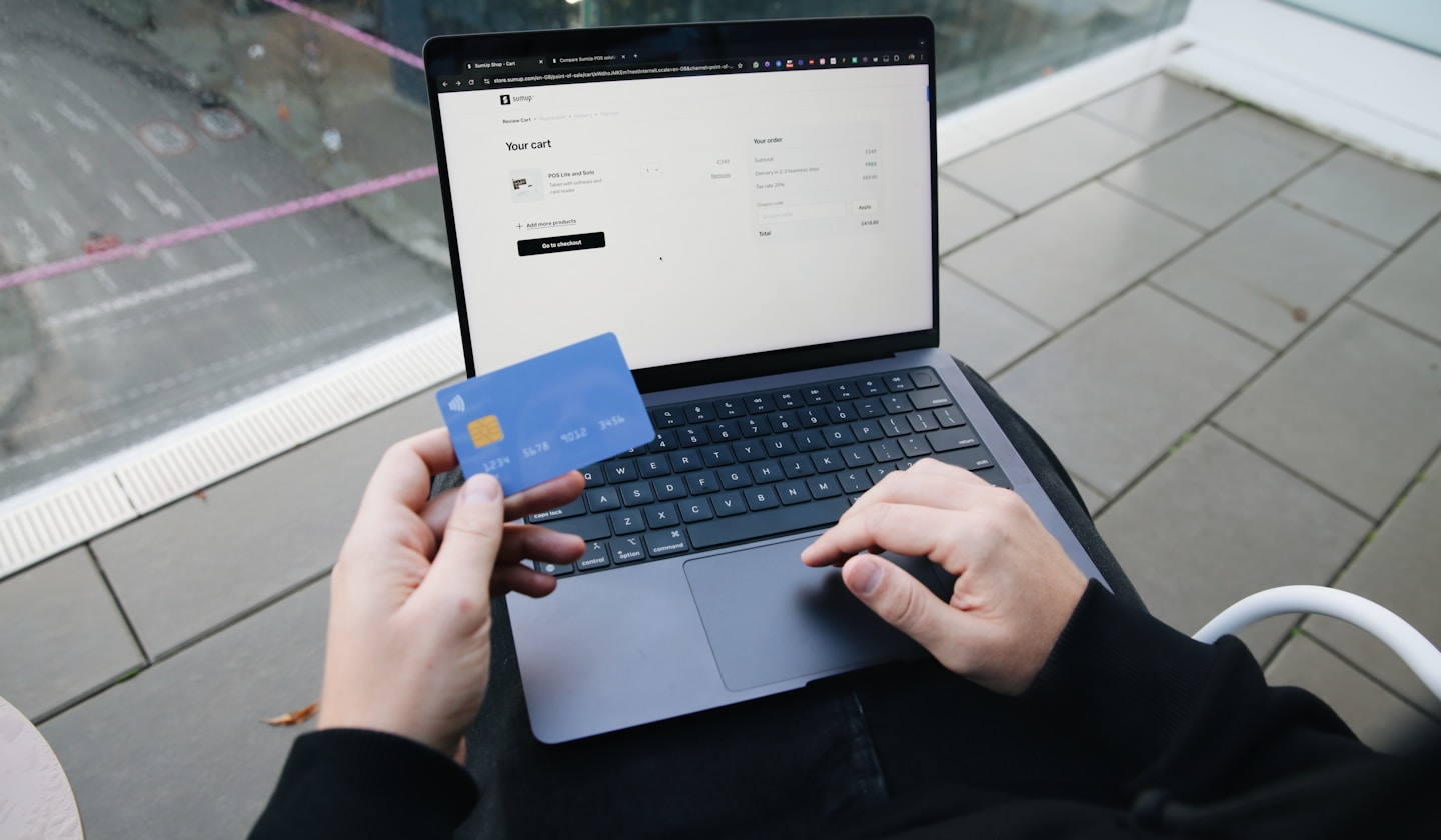
Make the final price obvious
Customers should understand what they will pay before the final confirmation. Unexpected taxes, shipping fees, subscription terms, or currency changes can damage trust at the most sensitive point in the funnel.
Use clear order summaries and make recurring billing terms visible before the customer submits payment.
Optimize for mobile first
A checkout that looks acceptable on desktop can still fail on a phone. Test keyboard behavior, field spacing, payment controls, error messages, autofill, and button placement on common mobile screen sizes.
Large tap targets and a single-column flow usually reduce avoidable mistakes.
Build trust without clutter
Use concise security messaging, recognizable payment methods, clear refund information, and accurate customer support details. Trust signals should reassure the customer without overwhelming the page.
The best checkout design feels calm, predictable, and fast.
Key takeaways
- Reduce fields and distractions.
- Show the real total before payment.
- Test the complete flow on mobile devices.
- Use trust signals that clarify rather than clutter.
Mars-Cart is being built around the same performance-commerce principles discussed throughout this guide: clear offer economics, useful affiliate distribution, conversion-focused checkout, and reporting that helps teams understand what is working.